When we were kids learning to mix paints in school we were taught that the primary colors were red, blue, and yellow. That was true for mixing paint, but it's not true when we're dealing with projected light, color printing, or color television.
In order to understand any motion picture color system, be it two-color, three-color, or even the rare four color, we must have a firm understanding of both the additive and subtractive color systems.
The Additive and Subtractive color palettes. Illustration by Jan-Eric Nyström.
Additive color systems use colored light passing through the image elements to reconstruct the full colors on the screen. Subtractive systems use multi-layered colored dyes to reconstruct the spectrum on the film and then white light projects through the image onto the screen.
In more simple terms, Additive color systems use black and white film which carries the records of the color in the photographed scene. The screen image appears in color by means of a color wheel rotating in sync with the film, or the use of individual dye stains of the appropriate color on each frame. Subtractive systems used what is best described as "color film", where the individual image layers are made up of color dyes. No extra color wheel or special treatment to the film is required.
While two-color motion picture processes were easier to produce, they are far more difficult to explain, so we'll begin this special tutorial explaining the full three-color systems.
To record the full color spectrum that is visible to the human eye, we need to record the three primary color components, which are red, blue, and green. This can be done by using black and white film and photographing each record through the appropriate filter. This gives us three black and white records that can be projected through the same filters, and if we're real careful about aligning our three images we'll get a relatively accurate representation of the original scene.
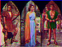
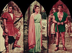
For the purposes of this tutorial, we'll use an image that has been specially modified to give us easily identifiable colors. The picture is taken from a promotional book for The Robe. I've altered Jean Simmons' dress to be a light blue color and Victor Mature's tunic to be a dark green. Richard Burton's red sash has been intensified slightly and his tunic is reddish brown.
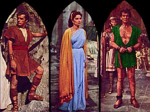
The full color image
Look at the image long enough to be able to keep its characteristics in memory. |
Illustration ©1953 Twentieth Century-Fox Film Corporation.
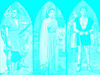
Additive Color System

Red Record
represented in black & white. | 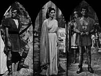
Green Record
represented in black & white. | 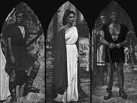
Blue Record
represented in black & white. |
Colors will appear lighter in their own color record because the film will receive a higher exposure. Thus we see that Richard Burton's sash and tunic are lightest in the red record, Jean Simmons' dress is lightest in the blue record, and Victor Mature's tunic is lightest in the green record. Neutral colors, ranging from white through grey to black, will receive nearly equal exposure in all three records.
Jean Simmons' cape is yellow-orange. It appears lightest in the red record, a little darker in the green record, and darkest in the blue record. The highlights, which are yellow, are very light in both the red and green records. Caucasian flesh tones are primarily red and green, with the blue record receiving far less exposure. This explains why two-color systems used red and green rather than red and blue.
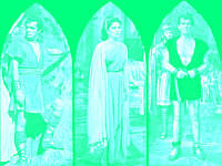
Now let's pretend that we're going to take those three black and white records and project them on a screen. We'll need three projectors or a single projector that can display three pictures. Each record will be shown through the same color filter used to photograph the picture in the first place. The filters will ADD the color to the black and white elements, thus we get the term Additive Color.
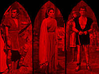
Red Record
as projected through a red filter. | 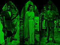
Green Record
as projected through a green filter. | 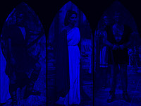
Blue Record
as projected through a blue filter. |
 Additive Image Projected Additive Image Projected
Required small projected size and had problems with component color alignment. |
By carefully aligning our three projected images, one on top of the other, we get an accurate representation of the original scene. Obviously several things are critical to this method of reproducing color. First we must align three separate images and try to maintain that alignment despite the fact that we are dealing with motion picture film which wants to shrink and wear, causing instability of the images independant of each other.
Another big drawback is that this method requires huge amounts of light because light colors must be created by combining the beams after they've passed through our light robbing filters. So we either pump up our projector lamps or settle on a small screen. No matter what we do, the picture will still not be terribly bright.
If we take all three of our images, tint them in their appropriate color, and stack them one on top of each other, it would seem that we'd get a full color image with a single projector. But, in fact, we would get nothing but black. The colors in the light areas of each element will cancel out each other so no light will pass at all. In order to place the color elements on top of each other we must use the subtractive method to be able to pass light through our film.
Subtractive Color System
Red Record
represented in black & white. |
Green Record
represented in black & white. |
Blue Record
represented in black & white. |
You will notice that the color records are the same regardless of whether we're using additive or subtractive colors. The difference between the two systems is the method of making a printed image that can be projected. We will make our print by using colors complementary or the opposite of the colors in our original records. These complementary colors are Cyan, a blue-green that is the opposite of red, Magenta a combination of red and blue, the opposite of green, and Yellow, a combination of red and green, the opposite of blue.
Red Record
represented in Cyan dye. | 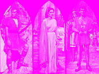
Green Record
represented in Magenta dye. | 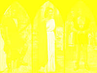
Blue Record
represented in Yellow dye. |
We are at the point in this narrative that is perhaps the most difficult to explain and understand. The pale nature of the individual dyes makes it hard to appreciate how much light they are capable of blocking where necessary. Look at Jean Simmons' dress in all three records. The yellow dye in the blue layer blocks blue light. Since the dress is light blue, there is little yellow dye in the dress, thus more blue light passes. Where the dye is the densest, no blue light will pass at all. Her yellow-orange cape almost completely blocks blue light, but the cape in the other two records is not as dense, thus red and green light will pass through the cyan and magenta filters. Victor Mature's tunic is at almost maximum density in the cyan dyed red record and the yellow dyed blue record, but the green blocking magenta record has the tunic at a low density, so some green light will pass, giving us a dark green tunic. The same thing happens with Richard Burton's sash. It is at maximum density in the yellow record, so little blue light passes, and it's at near maximum density in the magenta dyed green record, block most of the green, but it is at a lighter value in the cyan dyed red record, so mostly red light will pass.
Two-Color Subtractive Color System
Hopefully you now have an understanding of why each of the color records is printed in their opposite colors rather than in the color that they represent. Subtractive two-color systems are based on the same exact principals. Since they use of only red and green records makes it impossible to reproduce the full colors of the original subject, a bit of fudging was often done by using red-orange dyes to tint the green record and blue-green dyes to tint the red record. Otherwise, the red record would be tinted green and the green record would be tinted red, and the absolute lack of blue would be very obvious.
 Red Record Red Record
represented in blue-green dye. | 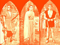 Green Record Green Record
represented in red-orange dye. |
The above images are approximations of the dyes that could be used to produce a two color image. Significant variation in the actual hues was possible without destroying the flesh tones. It is very difficult to accurately reproduce two-color images using three color systems such as computer displays, modern film stocks, and color television. The image below is an example of what our sample image would look like if it was photographed and printed in two-color. That image could be significantly altered in overall tone by changes in processing and the dyes used.
Simulation of two-color version of scene. |
As stated above, virtually no colors were reproduced accurately. Jean Simmons' dress is no longer pale blue. The yellow-orange cape is now a salmon hue. Whites could not be reproduced without becoming glaringly bright spots in the image, so sets and costumes were designed in various off-white tones. Yellows did not reproduce, grays and browns were also not accurately represented. Deep blacks were virtually impossible.
It's hard to believe that two-color systems continued to be used into the early 1950s. But they were, indeed. Cinecolor, for instance, had refined their system to the point that they could produce two-color prints from three-color negatives that looked quite realistic, though they may not have been accurate. And that's the movies for you, let it look real even if it's not accurate. But even Cinecolor and Consolidated Film Industries' Trucolor became three color systems after the advent of 35mm color negative stocks made the acquisition of full color images practical.
While this discussion primarily relates to the recording of color images on black & white films and printing the color records using dyes, the same principals hold true with monopack multi-layer negative and print films. The difference is that camera negative films carry layers of photographic emulsion that are sensitive to red, green, and blue, plus layers that act as filters to ensure that each color layer does not receive light that it is not designed to reproduce. Multi-layer print film works the same way, except the layers that are sensitive to red, blue, and green are chemically converted to cyan, magenta, and yellow dyes.


