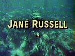
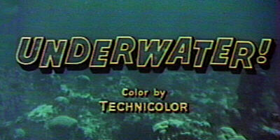
Frames from the opening of the initial RKO Superscope feature Underwater!. The Superscope extraction is seen next to the full frame original material.

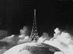
While Cinerama's black and white opening sequence served to emphasize the change from the old to the new, RKO's Superscope logo seemed to point out the fact that the studio never got around to producing a color version of their radio tower logo, created in the early 1930's. While the first few 3 strip Technicolor films were released by RKO, all color product up until 1946 was produced by the independents like Walt Disney, Merian C. Cooper and Jock Whitney.

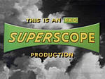
After opening with a still frame of the tower cropped down to the 2:1 format, the RKO Superscope title is laid over additional black and white clouds. The choice of green and yellow for the logo seems particularly unappetizing, though it might have provided inspiration to graphic designer Saul Bass when he created the M-G-M logo for Hitchcock's North by Northwest.
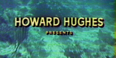

It's difficult to say whether Howard Hughes was interested in the film business or the Jane Russell business. Underwater was not a particularly good film but it was certainly far better than the initial Hughes/Russell vehicle The Outlaw which made Miss Russell's endowment, and to a lesser degree, Miss Russell herself, a star.
The studio's biggest properties property after Cary Grant's contract expired. Hughes had gone so far as to design a special brassiere for Miss Russell. Was he the aircraft engineer that Midge mentions to Scotty in Hitchcock's Vertigo?
Now that's just too many connections between this lackluster film and Hitchcock classics.
Freudian. The main title music was an instrumental version of "Cherry Pink and Apple Blossom White". (Ugh!) Was this a veiled reference to Miss Russell's "talent"?
Perhaps the curator's imagination is a bit too active, but perhaps it's not.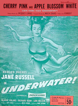
Skin Diver Action...
Aqua-lung Thrills!
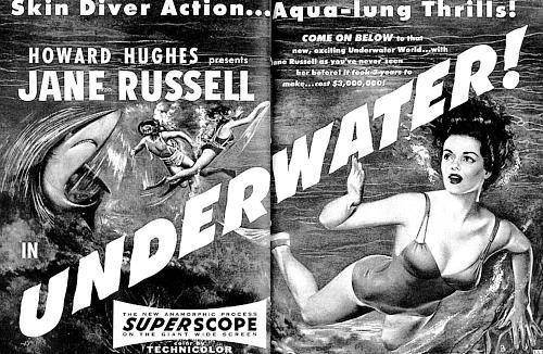
 ABOVE: Magazine ad for Underwater!.
The intentions of the text writer are hardly hidden, with terms like Skindiver action and Aqua-lung thrills, obviously directed towards the assets of the film's star.
ABOVE: Magazine ad for Underwater!.
The intentions of the text writer are hardly hidden, with terms like Skindiver action and Aqua-lung thrills, obviously directed towards the assets of the film's star.
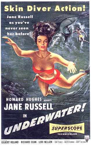
LEFT: The poster didn't have the suggestive wording but it had a bit more skin.
Courtesy of the Setnik Collection
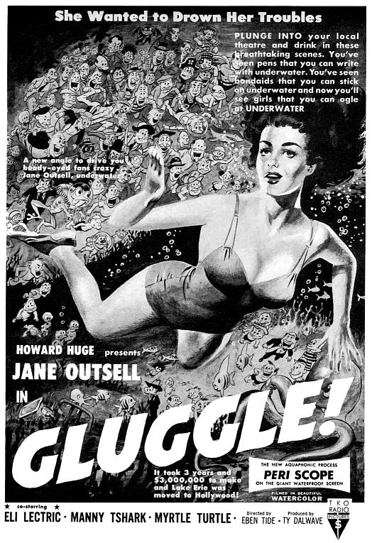
Recently discovered - old ad parody with fabulous artwork by Wallace Wood. The parody was in the first edition of Mad Magazine after it went from a comic book format to the magazine format.
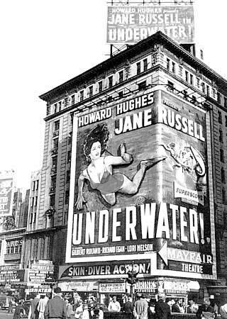 Wow! What a billboard! Audiences must have been outrageously disappointed when they saw this turkey. The film opened in New York's Mayfair Theatre.

Did audiences really know what "anamorphic" meant? In point of fact, the word really was an invention of 20th Century-Fox, who felt that the real term, "anamorphotic" had too many syllables. Early Panavision projection devices did use "anamorphotic" on their nameplates.
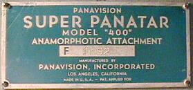
The Super Panatar was similar to the Superscope adjustable anamorphic projection lens. Or should be say anamorphotic projection lens?
Underwater! is a fairly dreadful movie and I've given it far more coverage than it deserves, but the materials are so campy that I couldn't resist the temptation.
Underwater! promotional photos courtesy of Stephen Paley